


+ view the comments
Every June, the design industry descends upon Chicago for NeoCon and Design Days; three days of showroom visits, product launches, trend spotting, and enough walking to justify every pastry noshed along the way.
This year felt different almost immediately.
Before anyone started talking about products, colors, or workplace trends, people were talking about attendance. Both the Merchandise Mart and Fulton Market felt energized in a way many attendees hadn’t experienced since before COVID. Showrooms were packed; conversations spilled into hallways, elevators, restaurants, and sidewalks; familiar faces seemed genuinely excited to be there. Whether driven by renewed investment, a stronger commercial market, or simply the value of gathering in person, there was a palpable sense of optimism that has been missing for several years.
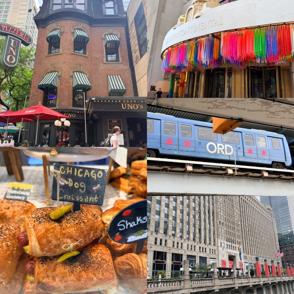
As always, Chicago itself was part of the experience. Between appointments there were architectural detours, rides on the Metra train, an obligatory stop at Uno’s, and perhaps my favorite discovery of the trip: a Chicago Dog Croissant. Equal parts absurd and brilliant, which honestly feels very Chicago.
What struck me most wasn’t necessarily the emergence of one dominant trend; it was how many manufacturers seemed to be revisiting familiar ideas through a contemporary lens. The strongest introductions felt less concerned with novelty for novelty’s sake and more focused on solving very human problems.
The most obvious example was acoustics.
If there was a category that dominated the showrooms, it was workplace privacy. Acoustic wall systems, ceiling elements, room dividers, and increasingly sophisticated sound booths appeared everywhere. Some were designed for heads-down focus work; others functioned more like miniature living rooms or meeting spaces tucked within larger environments.
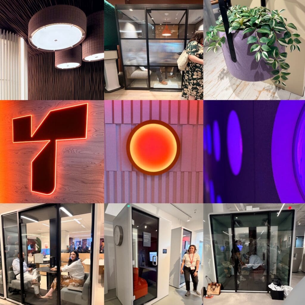
The conversation around workplace design seems to have come full circle. For years, offices chased openness and collaboration at all costs; now they’re trying to restore something that was lost along the way. As I walked through showroom after showroom, I was drawing parallels to the best designed homes. Good houses have always understood the value of retreat. Libraries, dens, breakfast nooks, window seats, screened porches—spaces that allow people to be together while also giving them room to breathe.
The technology may be new; the need certainly isn’t.
Color told a similar story.
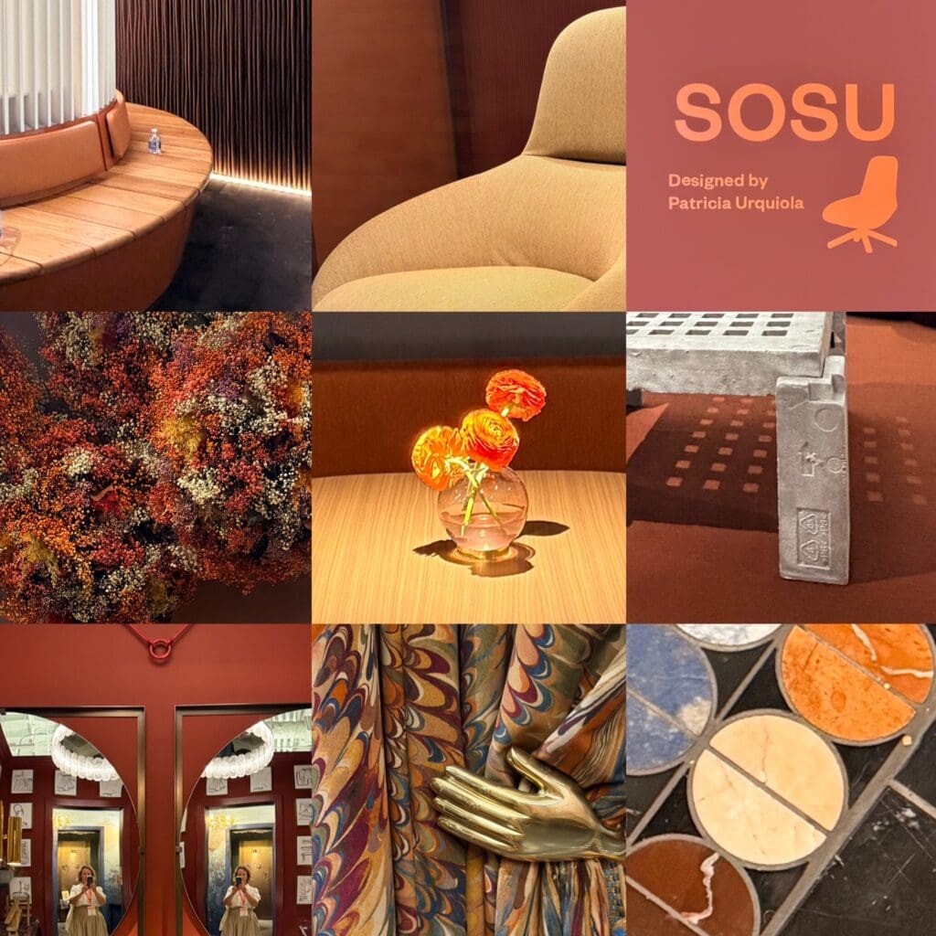
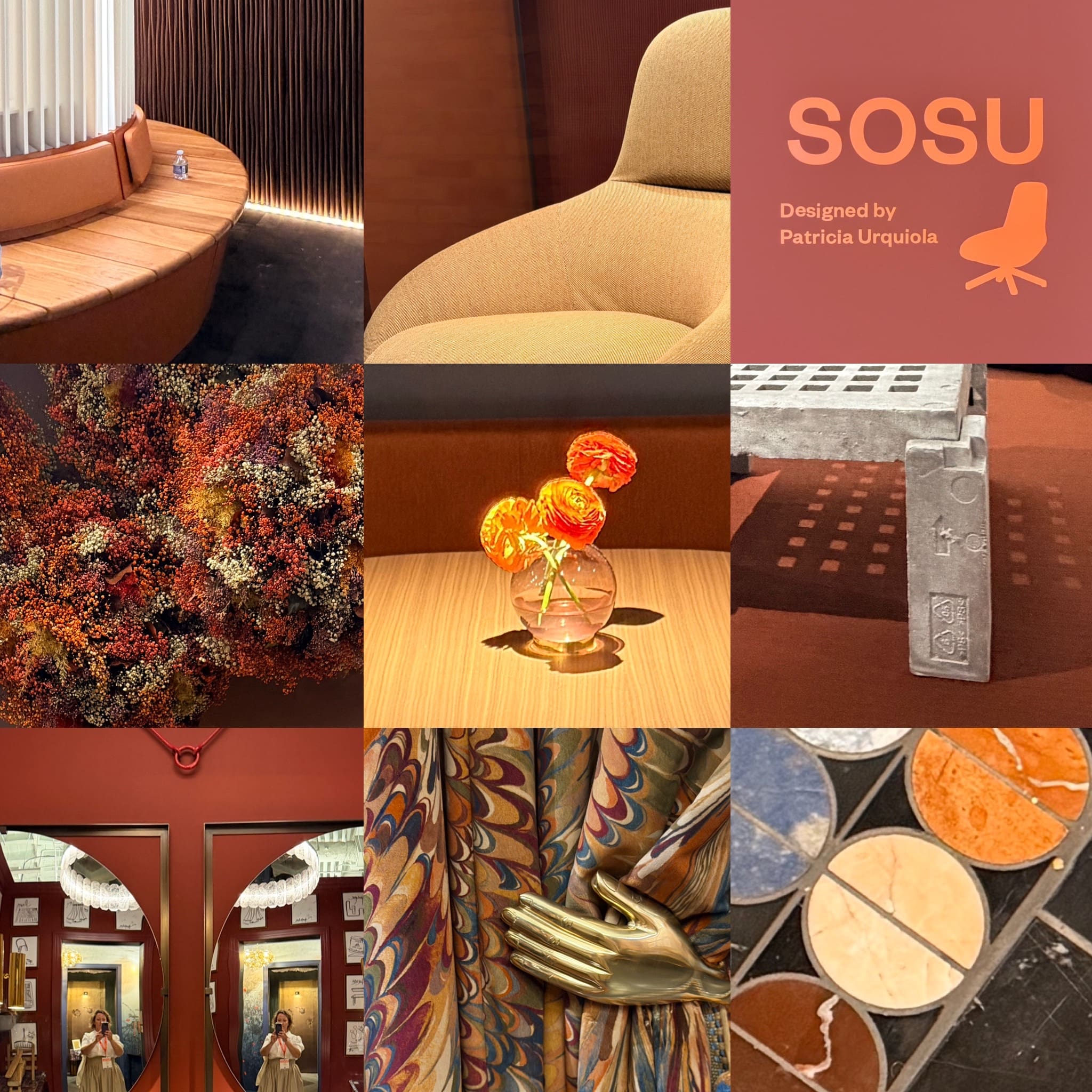
One shade appeared so consistently that we eventually gave it a nickname: the color you’d get if merlot and terra cotta had a baby.
It showed up on upholstery, acoustic products, signage, textiles and even t-shirts. Warm without feeling trendy, earthy without feeling rustic, it occupied that sweet spot between sophistication and comfort. Somewhere between clay, brick, cinnamon, and wine, it felt like a reaction to years of cool grays and stark minimalism (and Pantone’s color of the year, Cloud Dancer).
Again, not exactly a new idea.
Versions of this color have existed forever; you can find them in Mediterranean architecture, Arts and Crafts interiors, and countless midcentury palettes. What feels current is the way designers are pairing these richer tones with softer forms, tactile materials, and residential cues that make commercial spaces feel more welcoming.
Patterns and materials revealed another recurring thread – or maybe I was just looking for it!
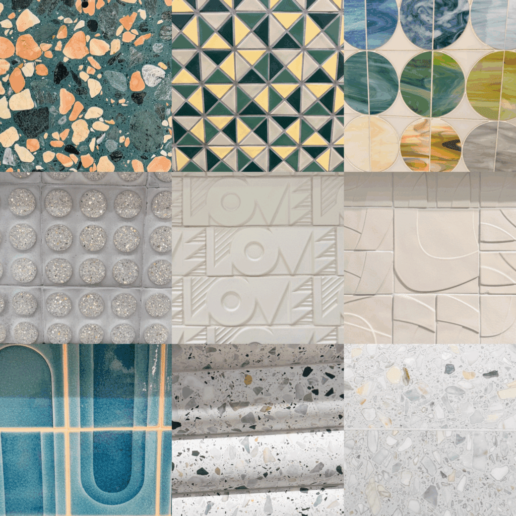
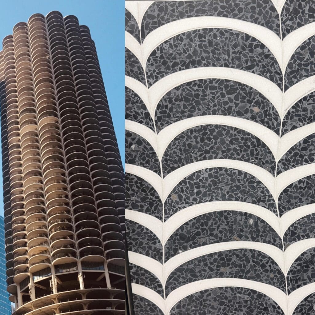
Geometric tile collections were everywhere, but the strongest examples weren’t relying on nostalgia. They borrowed from familiar forms—circles, arches, scallops, terrazzo, and Art Deco motifs—and reinterpreted them in ways that felt fresh. Several installations immediately reminded me of iconic Chicago architecture, particularly Marina City. Seeing a tile pattern that echoed the rhythm of those famous corncob towers while standing just a few blocks away felt like a reminder that good design rarely exists in isolation; it builds on a visual language that has been developing for decades.
Hospitality also continues to influence nearly every corner of commercial design. Lounge seating felt softer, lighting felt warmer, materials felt richer and more tactile. The most memorable showrooms were less concerned with looking like offices and more concerned with creating environments people genuinely wanted to spend time in. It was, thankfully, really hard to spot an office cubicle.
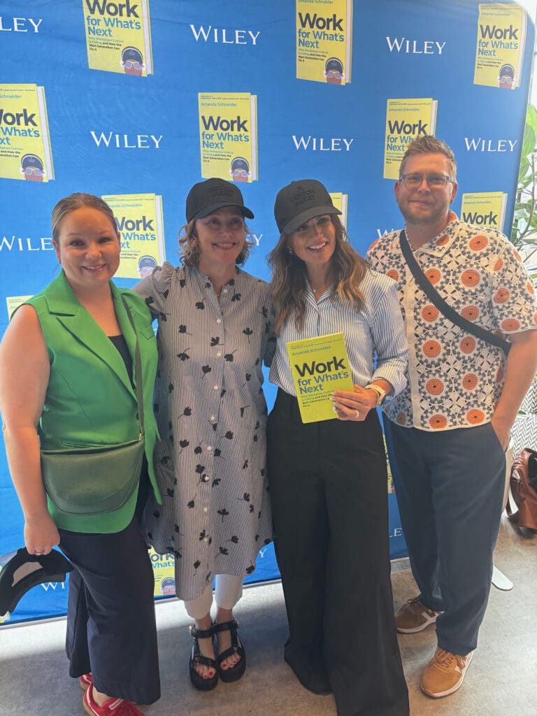
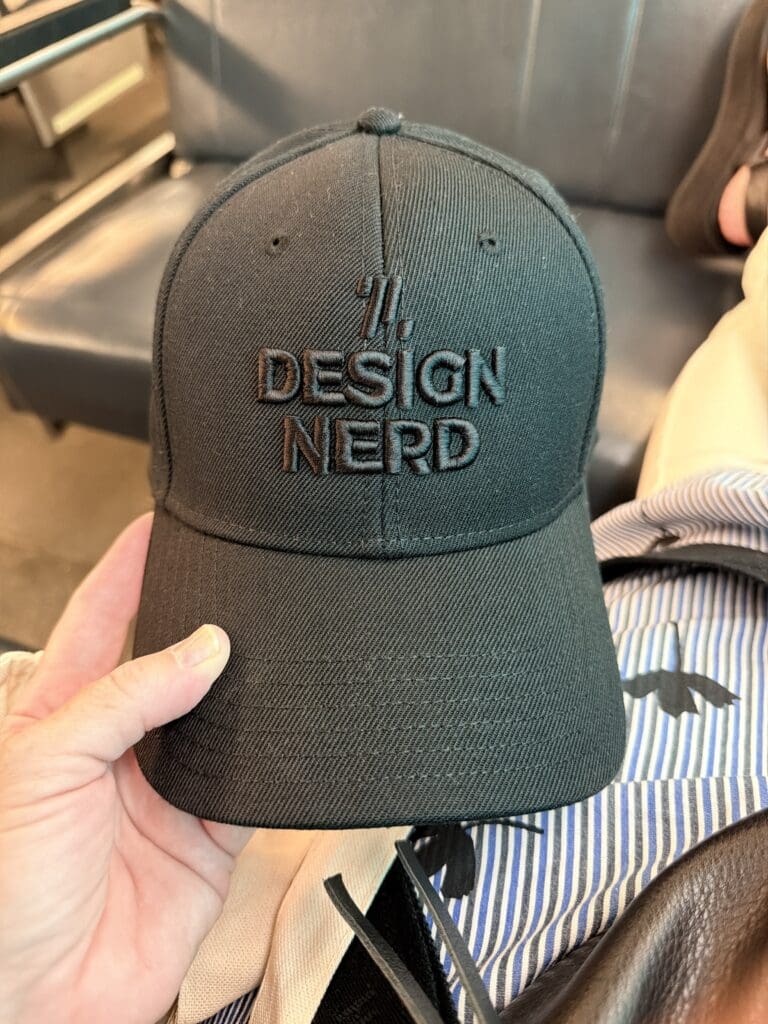
Another highlight for me was seeing long time Chicago design friends and celebrating my friend Amanda Schneider’s new book, Work for What’s Next, which discusses workplace culture across multiple generations. Amanda is the president of ThinkLab, a research think tank that leverages said research in the architecture and interiors industry to help companies and other interested parties replace assumptions with facts. And finally, I have my own Design Nerd hat! (Pictured L-R: Sara Hoeft, me, Amanda and Scott Steffes).
Looking back, perhaps the renewed excitement throughout NeoCon and Design Days wasn’t just about new products. The strongest ideas I saw this year shared a common thread: a growing recognition that people crave connection, comfort, beauty, and experiences that feel distinctly human. Whether expressed through acoustically private spaces, warm colors, hospitality-inspired environments, or patterns rooted in design history, many of this year’s introductions felt less like a break from the past and more like a thoughtful return to what has always mattered.
And I’m taking suggestions for the merlot-meets-terra cotta color!


Hey Betsy! Lived this. By far the best Neocon review I have read to date.
Top Recommendations:
1. Merlot Clay – Straightforward and descriptive, with a premium feel.
2. Tuscan Ember – Evokes Italian hillsides, warm fires, and that perfect blend of red wine and baked earth.
3. Vintage Terracotta – Nods to your love of vintage decor while capturing the aged, rich tone.
4. Sangiovese Dust – A wine-inspired twist (Sangiovese is a classic Tuscan red) with the dusty, earthy finish of terra cotta.
5. Rustic Bordeaux – Deep and sophisticated, blending French wine heritage with old-world clay warmth.